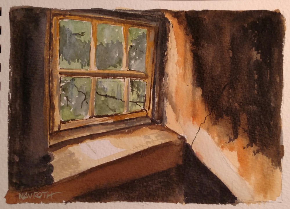
“Upstairs”

I painted this small piece last night after dinner. It’s done on Bockingford rough 140 lb. cold press paper by St. Cuthbert’s Mill, sized A5 (5.83 ×8.27″) that I got from Jackson’s Art in the UK. It takes washes and color well, and I found the rough texture very conducive to some drybrush effects.

Although I used a photograph for the subject, I altered it quite a bit to make it more moody and dark, to give the feel of an empty, abandoned attic space.  The view to the outdoors and the green trees gives the eye a place to escape, or makes one think of the former occupant who may have spent time dreaming of the freedom of that outdoor world beyond the dirty window panes.

I’ve worked hard lately to get rid of my typical precise style that’s dogged my work for decades. I don’t worry so much if lines are not exactly straight, though I do try to achieve a modicum of perspective. I may have gone a bit too far with that in this one, but I think the lack of preciseness adds to the quality of mood.

Each painting I do now is a stepping stone on a path I’m traveling to find my way to a new style, and to capture things that move me in paint.

3-28-16 Upstairs


“Managing the Artist Within”

Rather than posting something I’ve painted today, I’d like to share this wonderful article I found on Huffington Post, “Maintaining the Artist Within” by Brianna Upton. I especially resonated with her exhortation, “Stop trying to create a masterpiece and simply keep a well-oiled machine. Keep it moving. Create, create, create.” That is something that sometimes trips me up–the feeling that everything I paint has to mean something, be valuable. I have embraced doing endless color exercises and painting vignettes to try and work out a composition to overcome this.

Here is the article (not a long one) in its entirety:

http://www.huffingtonpost.com/brianna-upton/maintaining-the-artist-wi_b_9201576.html

“The Melancholy of Memories”

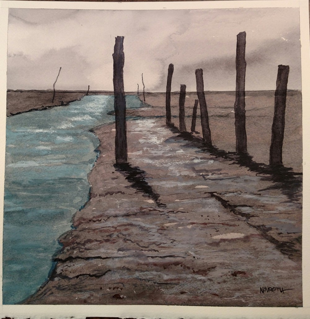
Lately I’ve been absorbed in some of the odder Daniel Smith colors, using them in my latest work to try them out. I didn’t intend for the work to be so grim-looking, but the colors lend themselves easily to this sort of mood. The colors used in this 14″ x 14″ piece on Arches 140lb. CP paper are: Neutral Tint, Bloodstone Genuine, Shadow Violet, and Moonglow. There are also touches of Piemonite Genuine. The Shadow Violet is the base layer on the mudflats; it has a bluish pigment that separates from it in wet washes that creates an interesting granularity. The sky is a pale wash of Bloodstone. The posts and their shadows are Neutral tint.

For the water I used some Cobalt Turquoise mixed with a bit of Shadow Violet. And over it, and large areas of the mudflats, I used the various colors listed above with M. Graham Titanium White gouache to create grays and subtle tones.

I’ll probably work on this one a bit more, putting in some touches to make the edge where the water and land meet in the foreground, and carry the texturing over into the flat area of color to the right of the line of posts so it trails off into the distance so it doesn’t look so abrupt. But for now, I’ll think about that and move on to something else and let this one percolate on the back burner for awhile.

IMG_20160324_071107

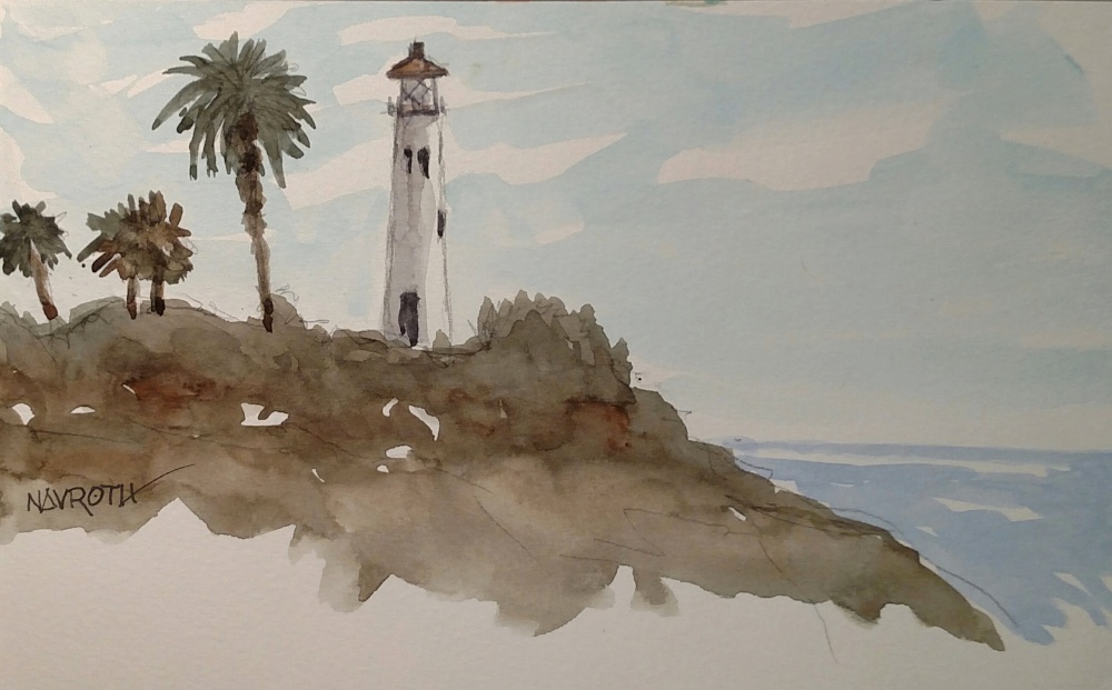
Point Vicente Lighthouse, Palos Verdes

Yesterday I painted with a new Meet-Up group (Art Out) and the location was nonce other that the Pt. Vicente Lighthouse in Palos Verdes. I grew up in the area, and had driven by this famous place hundreds of times, but had never actually stopped there. So I jumped at the opportunity to spend an afternoon painting there.

I couldn’t find the painting group when I arrived; it was very crowded, most of the people were there for whale watching, and the parking was already pretty full. I walked around a bit and tried to find other painters, but didn’t see anyone. So I found a spot I liked and started with some sketching. I did both thumbnails and rough sketches of the palm trees, pelicans, and cliffs–just getting a feel for the place and trying to pin down a composition that I liked. I sat a long time and just looked.

In reality it was not an ideal view I’d chosen, but I’d found a spot behind some bushes out of the breeze. The cliffs were interesting, and the colors and textures seductive, but I finally nixed putting in the whole cliff and went for just the suggestion of this lighthouse perched at the edge of land, with nothing but the sea beyond. I purposefully trailed off the lower half of the painting to give a suggestion of the impermanence of the place; this area is know for it’s constant shifting of land and there’s been many times when whole chunks of cliffside have fallen into the sea. Somehow this lighthouse has been spared, but I’m sure it’s time will come.

Anyway, I was happy with the way it turned out, and I think I will be using this painting and some photos I took as reference for a larger work.

Details: 5.5″ x 8.5″ watercolor and pencil on Global Art Materials sketch book

3-19-16

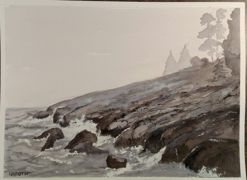
“At the Edge of the Known World”

On the recommendation of writer / artist David Tripp I picked up a copy of The Two Worlds of Andrew Wyeth by Thomas Hoving. I could not have been more pleasantly surprised at how this book has affected me. It is the most penetratingly insightful look into an artist’s process, how he feels about, and his work evolves over time that I’ve ever read. POW! Right between the eyes and straight into the heart!

Yesterday I revisited the paintings by Wyeth with fresh eyes, and I was astounded by how much more deeply I felt about them. Rather than just skimming or glancing, however, I spent a lot of time looking at individual paintings to suss out all the nuances and subtle touches that he puts into his paintings.

And having done all that looking and reading, I was moved and excited to get another painting going, resulting in the work below, which I’ve title “At the Edge of the Know World”. It’s also an experiment with some blacks I’ve been trying out: Chromium Black (Winsor and Newton), Ivory Black (M. Graham), Neutral Tint (Daniel Smith). I also used a hint of Mineral Violet (Holbein) because the Neutral tint has a purple-ish cast to it when thinned out. The Chromium Black was a delightful surprise: it’s not really black at all unless used full-strength; it’s got a weird reddish-purple look to it. I also used some white gouache for the foam and for some drybrush texturizing on the rocks. The sky is a pale wash of the Chromium Black, which doesn’t show up so well in the photo, but it has a purple-ish tint to it as well. And it’s possible the best wash I’ve ever done, using my new #14 Joseph Zubukvic squirrel mop brush–that thing really holds a load of water!

I am very pleased with how it came out and I am more anxious than ever to get going on more work. I have notes and sketches for new pieces, using titles and subjects I’ve been mulling over for weeks. The journey continues!

Thanks for reading and I’d love to have your impressions on the work.

IMG_20160315_210402

A Walk in the Park

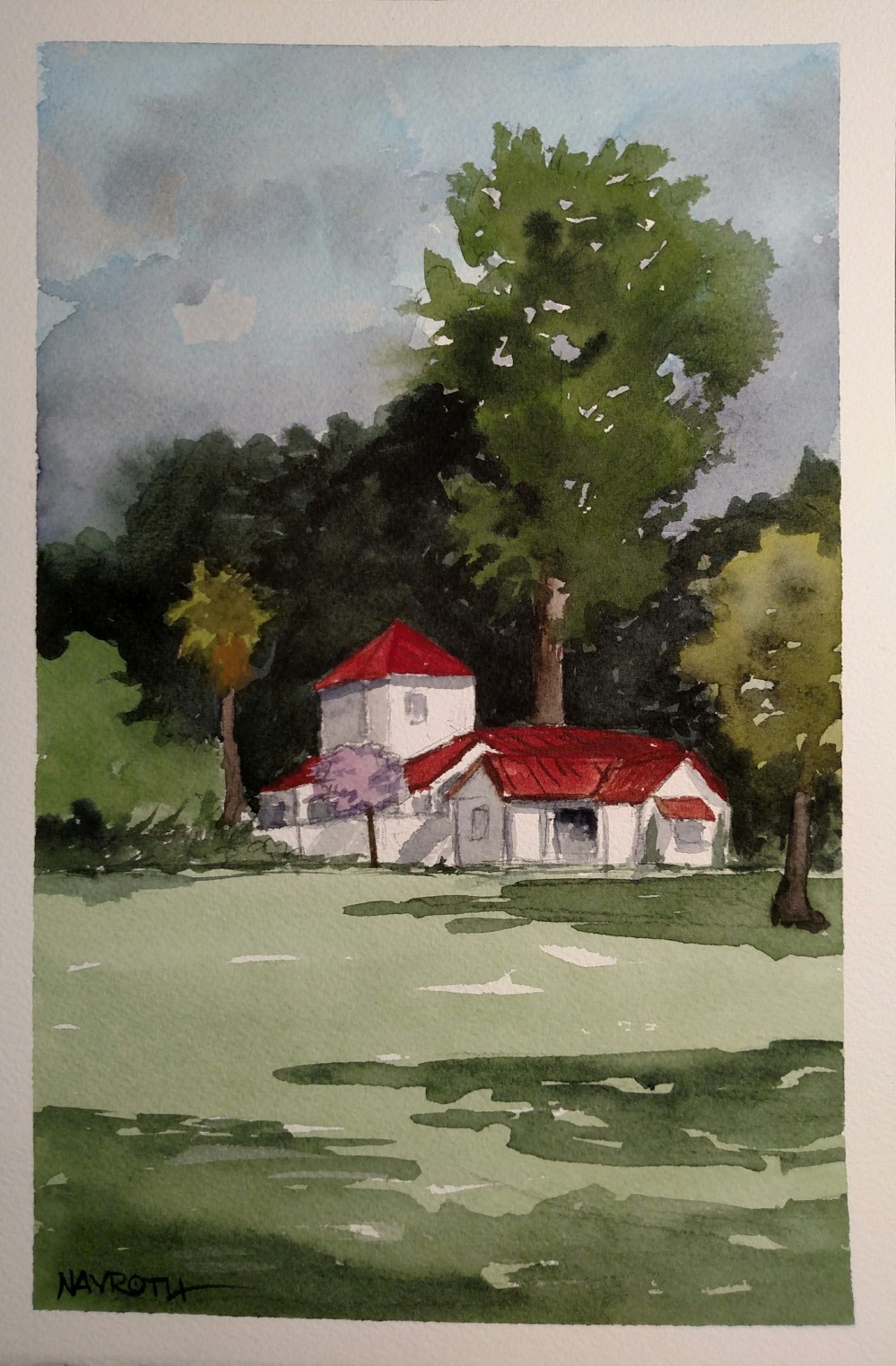
Yesterday I took the dog for a nice long walk in a beautiful park that’s not too far from my home. It’s in an upscale neighborhood, so it’s clean and has a better class of dogs (the owners are another matter entirely, and I’ll just leave that alone).

One of the really nice things about the place is that there are beautiful specimen trees all over the grounds, and they have placed nameplates on most of them so you can tell what they are. Two of the best finds yesterday was a Cape Chestnut (which unfortunately is a victim of either termites or some other borer) and a Camphor tree. I’d seen trees like this for years all over the area, including my neighborhood, and always wondered what it was. It was a nice ‘aha’ moment.

Since I had the dog and he’s pretty much a handful around other dogs, sketching or painting with him is out of the question. I did take some good photos, and when I got home, used one I really liked for a painting; the memory of the light and colors were still very fresh in my memory.

When I was done with it, I was absolutely amazed at how well it came out. This, I thought to myself, is the kind of work I only dreamed of doing a few years ago. And I know it is a reward for painting more often and spending time with color mixing and brushwork.

The colors are far richer and deeper than I used to do; my work always had a flat quality that I hated; there was absolutely no sense of depth and light. In the past, my pigment application was too pale, too timid.Now I put the color down boldly and with more confidence.

I still have a long way to go to get where I really want to be with my work, but right now I am very happy with the results I’m getting and it spurs me to do even more. I’d like to give a nod to David Tripp for his excellent blog, which not only inspired me to blog again, but also has recommended some great books (more about those in another post!)

Thanks for stopping by and having a look. And if you are an artist just getting started: Paint, Paint, PAINT!

IMG_20160313_164453

It’s been a good week

I had my best week of painting ever. I’ve wanted to be able to paint every day (or almost every day) for a long time and this week it finally happened; I’ve painted every day (and sometimes twice a day) since this past Sunday, and have done 5 paintings in my sketchbook and two small ones on Arches 140 lb. cold press. The sense of accomplishment is overwhelming.

The real benefit of painting more often as it’s gotten easier to put paint down and my drawing skills have improved enormously. I can literally draw just about anything I see now, and can readily put down things from memory if I need to. My sense of perspective is better. My color and values are more natural and I’m finally getting a sense of light and space that always eluded me.

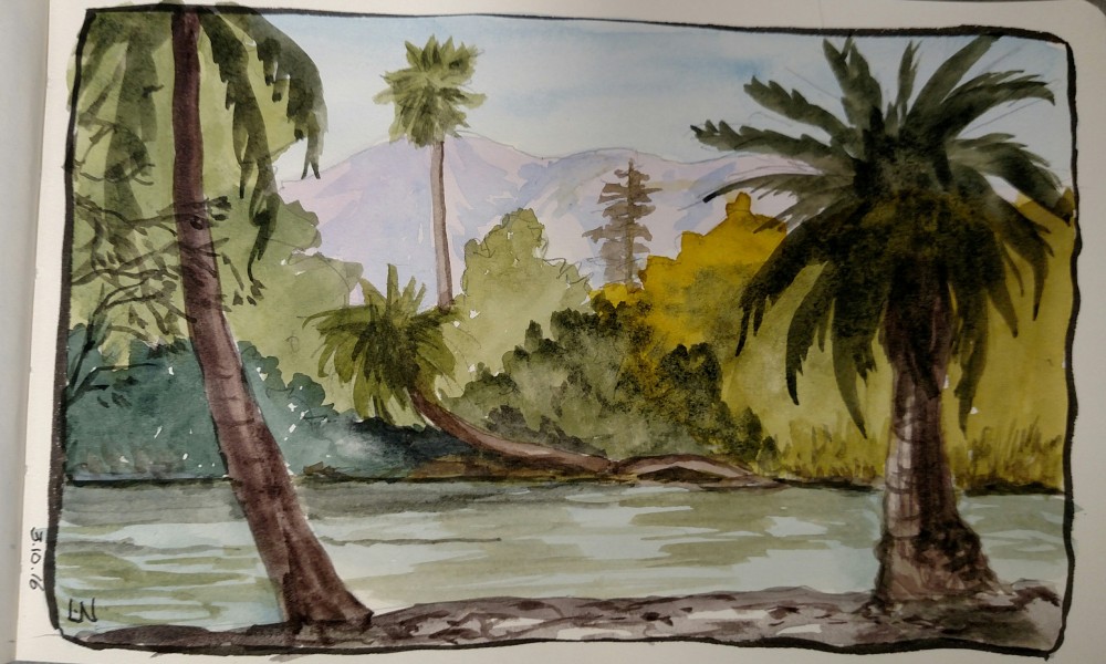
Yesterday at lunch I did this 5×8 painting in about 25 minutes. It’s from a photo taken at the Los Angeles Arboretum.

arboretum 3-10-16

A little hiatus, but the journey continues

I still haven’t really gotten the hang of WordPress and how all the functions work; I was on Blogger for a long time and had gotten comfortable with their format. But then they changed things and I lost a ton of photos I’d posted, so I said adios. But WP is a bit more complicated for me to suss, so I haven’t written anything in a while. But the painting has not stopped!

Not long ago I made a pact with myself that if I was ever going to improve as a painter, I was going to have to paint a lot more often. And so I vowed to paint at least one painting a day, starting with painting during my lunch hour at work.

This is not hard to accomplish, since I have my own office and it’s quite isolated away from a lot of the regular activity of the university department I work in. I have an hour, and I usually bring my own lunch so I can eat any time I want. So I spend at least half to three quarters of that hour drawing and painting. And this week it started to pay off big time.

The first thing I began to notice was that since I was on a time limit, I had to paint more quickly. So I just left a set of tools at work that I could use and I decided to use a 5×8 sketchbook with paper that can take a watercolor wash reasonably well. Then I picked up a Winsor & Newton Cotman Field Box and reloaded it with my own pigments. I like the size of that box, and it’s lightweight compared to the little metal boxes I generally carry. I have a set of Escoda Verstil travel brushes, a mechanical pencil, and an ink pen loaded with black waterproof ink that I carry in a little zippered pouch. With that and the field box, I am ready to paint at a moment’s notice–and it’s easy to clean up afterwards.

In a week’s time I have seen quite a nice improvement in my work, and I am getting very adept and getting down an image quickly and satisfactorily. Here’s a sampling of the paintings that I’ve cranked out lately…

I must confess I use photos as reference; the top left is from a painting by Winslow Homer, the top right and below were just found online. I’m not selling these, so I don’t think any real crime has been committed.

Practice does indeed pay off. I kept failing to realize that art was like any other skill: if you practice it enough, you cannot but help become better at it!

And so I think the take-away for my readers would be this: don’t let excuses and your own babbling mind prevent you from finding time to do your artwork. Carve out a chunk of time by either getting up earlier, staying up later, using some of your lunch hour–whatever it takes. But make a commitment to it. I have found that within a week of doing this I now look for even more ways to carve out some time. In the words of Nike: “Just do it!”